

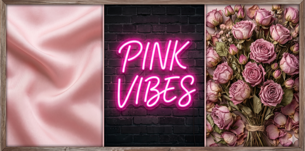
When you think of the pink color, what comes to mind? For decades, this hue was narrowly categorized, but today, modern color theory has proven its incredible versatility. From soft, muted blush to vibrant, high-energy magenta, the pink color is a powerhouse in both digital design and physical spaces.
Whether you are designing a sleek new brand identity, planning a wedding, or repainting your living room, finding the perfect combinations is essential. In this guide, we will explore the psychology behind this vibrant hue and break down the best pink color palette ideas to elevate your next creative project.
The Psychology Behind the Pink Color
Before diving into specific palettes, it is important to understand the emotional weight of your choices. In color psychology, pink is uniquely positioned as a tint of red, meaning it carries passion but softens it with the purity of white. Different shades evoke entirely different psychological responses:
• Light Pink (Blush, Millennial Pink): Communicates tenderness, healing, and peace. It is highly effective in wellness branding.
• Bright Pink (Fuchsia, Hot Pink): Evokes excitement, youthfulness, and high energy. Often used for bold marketing campaigns.
• Dusty Pink (Rose, Mauve): Feels sophisticated, nostalgic, and grounded.
4 Stunning Pink Color Palette Ideas
If you are looking for inspiration, here is a quick summary of four distinct pink color palette ideas that balance aesthetics with proven design principles. Below the table, you will find the specific pink hex codes to use for your digital projects.
| Palette Name | The Vibe | Suggested Hex Codes |
| Monochromatic Blush | Elegant, minimalist, calming | #FADCD9, #F8AFA6, #F79489 |
| Pink & Emerald Green | Luxurious, vibrant, natural | #FFB6C1, #50C878, #023020 |
| Dusty Pink & Neutrals | Warm, boho-chic, sophisticated | #DDA7A5, #E2D4B7, #8B5A2B |
| Electric Magenta & Navy | Bold, tech-forward, trustworthy | #FF00FF, #000080, #F0F8FF |
1. The Monochromatic Blush Pink Color Palette
This blush pink color palette uses varying shades and tints of a single pink hue to create a harmonious, soothing visual experience. Best for skincare branding, bedroom interiors, and modern wedding themes.
2. Pink and Emerald Green (Complementary)
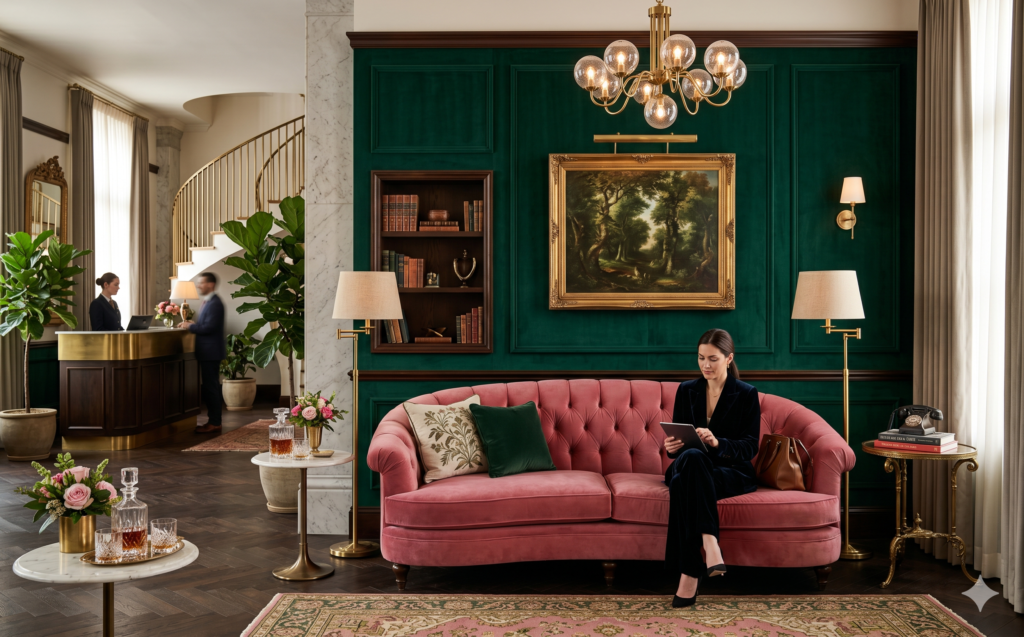
Sitting opposite each other on the color wheel, pink and green create high contrast that instantly draws the eye without clashing. Best for boutique hotel interiors, packaging design, and floral arrangements.
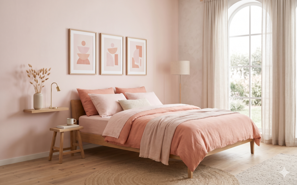
3. Dusty Pink and Earthy Neutrals
Grounding pink hues with warm neutrals like beige, taupe, or terracotta prevents the design from feeling overly sweet or juvenile. Best for living room decor and lifestyle blogs.
4. Electric Magenta and Navy Blue

If you need an edgy, modern pink color palette idea, pairing a highly saturated pink with a deep, authoritative blue creates a striking balance between fun and professional.
How to Apply a Pink Color Palette in Your Projects
For Interior Design: Trending Paints & The 60-30-10 Rule
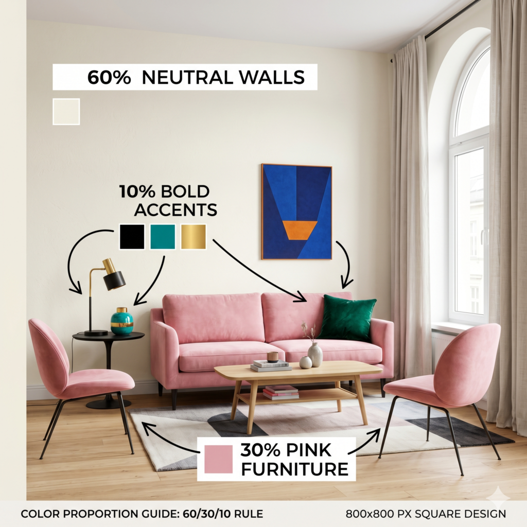
When applying pink hues to a room, use the 60-30-10 rule to maintain balance (60% neutral dominant wall color, 30% pink secondary color for furniture, 10% bold accent color). If you are using real paint, match your digital hex codes to popular designer shades like Farrow & Ball’s “Sulking Room Pink” or Benjamin Moore’s “First Light” to ensure a highly aesthetic, premium finish.
For Graphic Design: Tools & Accessibility
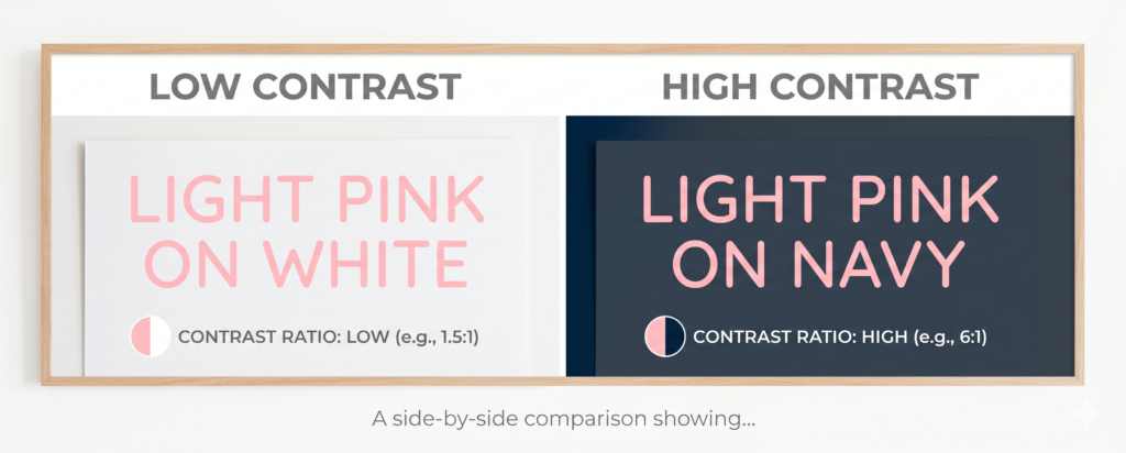
In digital spaces, ensure your pink color palette ideas pass web accessibility standards. Light pink text on a white background is incredibly difficult to read. Always pair a lighter pink background with dark typography (like charcoal or navy) to ensure high contrast and readability for all users.
Tools to Test Your Pink Color Palette
Before finalizing your branding or design project, use digital tools to refine your combinations. Adobe Color is excellent for finding mathematically perfect complementary shades, while Coolors.co allows you to generate a trendy, aesthetic pink palette on the fly.
Frequently Asked Questions (FAQs)
1. What are the best colors that go with pink?
Green and blue are the best colors that go with pink naturally. Emerald green provides a luxurious contrast, while navy or powder blue offers a highly balanced and calming aesthetic.
2. Is the pink color considered warm or cool?
Generally, pink is considered a warm color because its base is red. However, shades like fuchsia or magenta that have blue undertones can lean toward the cool end of the spectrum.
3. Can pink be used in professional corporate branding?
Absolutely. When paired with authoritative neutrals like navy blue, charcoal grey, or deep forest green, pink acts as a modern, approachable accent that stands out in corporate spaces.
4. What does the pink color represent in psychology?
Depending on the shade, it represents compassion, nurturing, and youthfulness. Lighter pinks evoke calm and healing, while brighter pinks evoke passion and high energy.
5. What are the pink hex codes for Millennial Pink?
While it can vary slightly depending on the interpretation, the widely accepted pink hex codes for Millennial Pink are #FFD1DC or #F3CFC6.
6. How do I tone down a bright pink wall?
If a pink room feels too overwhelming, incorporate earthy neutral textiles—such as beige rugs, terracotta pots, or natural wood furniture—to absorb the brightness and ground the space.
7. What is the difference between blush and rose pink?
Blush is a very soft, pale pink with slightly warm or peach undertones. Rose pink is typically deeper and slightly more muted or ‘dusty.’
8. How do I make pink text readable on a website?
Contrast is key for web accessibility. Avoid placing pink text on a white or light background. Instead, use dark backgrounds (like black or dark grey) or use very dark pink (burgundy) on a light background.
9. What are the most popular pink paint brands for bedrooms?
Interior designers frequently recommend Benjamin Moore’s ‘First Light’ for a soft, airy feel, and Farrow & Ball’s ‘Setting Plaster’ for a historic, sophisticated dusty pink look.
10. What is a monochromatic pink palette?
A monochromatic palette utilizes different shades, tints, and tones of just one base color. For pink, this means pairing a light blush with a medium rose and a dark magenta.