

If you have ever stared at a beautifully intricate coloring page only to feel paralyzed by which pencil to pick up first, you are not alone. Choosing the right colors is the difference between a cluttered page and a masterpiece. That is where color theory for adult coloring comes in—a set of artistic “cheat codes” that ensure your colors always look harmonious, intentional, and vibrant.
Whether you are using colored pencils, markers, or gel pens, understanding the color wheel for artists will transform your hobby into an art form. In this guide, we will provide essential adult coloring tips and break down in simple steps.
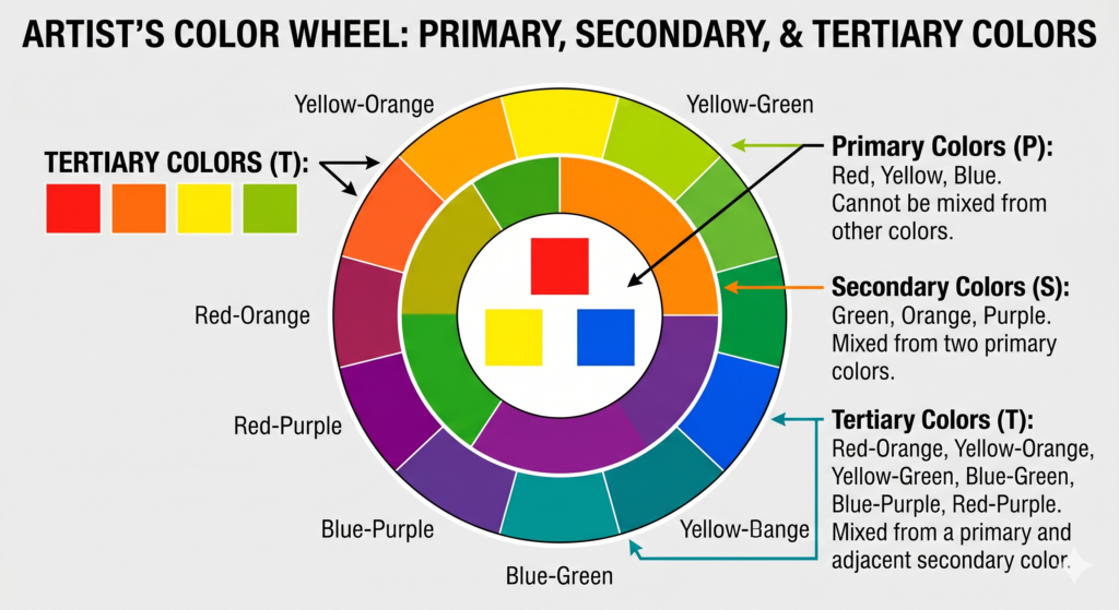
1. The Foundation: Understanding the Color Wheel
The color wheel is the primary tool for any artist. It organizes colors based on their relationships to one another, making it easy to identify which shades will clash and which will complement.
Primary, Secondary, and Tertiary Colors
- Primary Colors: Red, Yellow, and Blue. These are the foundation of every monochromatic color palette or complex scheme.
- Secondary Colors: Orange, Green, and Purple. Created by mixing two primaries.
- Tertiary Colors: Useful “in-between” shades like Blue-Green (Teal) or Red-Violet (Magenta).
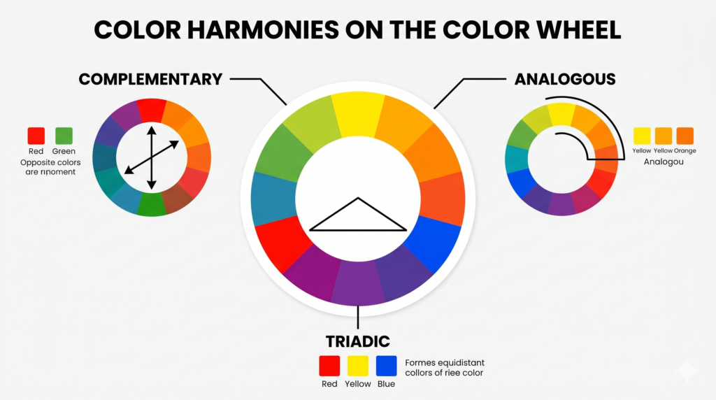
2. Advanced Color Schemes for Harmonious Results
To “beat” the basic look of a standard coloring page, you need to utilize specific color harmonies. These color pairings naturally look great together to be pleasing to human eye.
| Scheme Type | Definition | Pro Application Tip |
|---|---|---|
| Complementary color schemes | Colors directly opposite each other (e.g., Blue and Orange). | Use one as the background and the other for small “pop” details to create high contrast. |
| Analogous colors examples | 3-4 colors sitting next to each other (e.g., Yellow, Yellow-Green, Green). | Ideal for nature scenes like forests or sunsets to create a serene, seamless flow. |
| Triadic color harmony | Three colors equally spaced (e.g., Purple, Orange, Green). | Creates a vibrant, balanced look. Let one color dominate and use the others as accents. |
| Monochromatic color palette | Different values (tints and shades) of a single hue. | Perfect for practicing shading and highlights without worrying about color clashing. |
3. Beyond the Wheel: Tints and Shades
One common mistake in adult coloring is using colors that are all the same “weight.” To add depth, you must understand the difference between tints and shades:
- Tint: Adding white to a color to make it lighter (Pastels).
- Shade: Adding black to a color to make it darker (Navy, Forest Green).
4. The Psychology of Color in Art Therapy
Because art therapy coloring is often used for mindfulness and stress reduction, your palette choices impact your mood. Understanding color psychology in art can help you choose the right vibe for your session:
- Warm Colors (Reds, Oranges): Energizing and passionate; great for high-energy floral mandalas.
- Cool Colors (Blues, Greens): Calming and restorative; ideal for tranquil landscapes.
5. Professional Pro-Tips for Your Next Page
- The 60-30-10 Rule: Use a dominant color for 60% of the page, a secondary color for 30%, and a bold accent color for the final 10%.
- Test Your Palette: Always keep a “scrap sheet” of the same paper type to swatch your monochromatic color palette blends before applying them to your main project.
- Limit Your Palette: These adult coloring tips work best when you stick to 3-5 curated colors rather than using every pencil in the box.
Conclusion
By following these adult coloring tips and mastering the color wheel for artists, you turn a simple hobby into a creative journey. Explore our premium collection of coloring books to bring your vision to life.
Frequently Asked Questions (FAQ)
- What is the best way to start with color theory for adult coloring?
The best way to start is by using the color wheel for artists to choose just two or three colors. Beginners often find success starting with an analogous color scheme (colors next to each other), as it’s nearly impossible to make these look uncoordinated. - What is the difference between a tint and a shade?
In coloring, a tint is a lighter version of a color created by applying very light pressure or adding white. A shade is a darker version created by adding black or a dark complementary color to increase depth. - How do I make my coloring look more professional?
Follow the 60-30-10 rule: Use a primary color for 60% of the page, a secondary for 30%, and a bold accent for 10%. This creates a balanced, curated look rather than a chaotic one. - Why do my colors look “muddy” when I blend them?
Muddy colors usually happen when you blend two complementary colors (opposites on the wheel) directly together. To avoid this, use a “bridge” color or only use opposites for contrast, not for smooth blending. - What are “warm” and “cool” colors? Warm colors
(reds, oranges, yellows) evoke energy and sunlight. Cool colors (blues, greens, purples) evoke calm and water. Choosing one temperature for a whole page is a great way to create a specific mood in art therapy coloring. - Can I use a monochromatic color palette for a complex page?
Absolutely! A monochromatic color palette uses different values of a single color. It’s a sophisticated way to make a page look elegant and is excellent for practicing your shading techniques. - How do I choose colors for a nature scene?
Look for analogous colors examples in real life. For a forest, use greens, yellow-greens, and teals. For a sunset, use oranges, pinks, and purples. Nature naturally follows color theory! - How do i apply color theory with different mediums ?
While you can use any medium, colored pencils are the easiest for practicing tints and shades because you can control the pressure. However, markers are fantastic for high-contrast triadic color harmonies. - How does color psychology in art affect my coloring?
Colors trigger emotional responses. For example, blue can lower stress levels, while bright red can increase energy. Use color psychology in art to match your coloring session to your current mental state. - Do I have to follow color theory rules every time?
Not at all! While these adult coloring tips provide a great foundation for professional results, the most important part of the hobby is enjoying yourself. Use the rules as a guide, but don’t be afraid to break them!